Getting your website images and logos right from the start
When you’re pulling content together for a new website, words are only half the story. The images and logos you choose can make or break the overall look and feel. A fuzzy logo or poorly cropped photo doesn’t just spoil the design — it can also make your business look less professional.
The good news? A few simple choices will give your site a polished, consistent look across desktop, mobile, and even social media shares.
iI you’d like a full breakdown of text content as well, see my Page by Page Content Guide

🎨 Your Logo
-
Send your logo in its original vector format (.AI, .EPS, or .SVG)
-
These formats keep it sharp across all screen sizes
-
If you don’t have one, I can help with a high-resolution PNG
📸 How many images do you need?
-
Home page: 5–8 strong, brand-representative images
-
Other pages: 3–5 per page
-
Gallery/portfolio items: 1–3 per project
💡 Tips for choosing the right images
Here’s what works best:
- Choose high-quality, high-resolution images
- Prefer landscape (horizontal) images with space around the subject
- Leave breathing room — tightly cropped photos are harder to adapt for mobile
- Pick wide (16:9) images for banners and full-width sections
- Avoid text on images — I’ll add any wording separately so it stays readable
(Also worth a read: Website Images & Copyright: Avoid the Pitfalls — a quick refresher on copyright rules.)
🌐 Where to source images
- Use your own photography where possible
- Browse my premium Freepik library for stock images
- Or explore affordable options like Unsplash and Pexels
(For more ideas, see Finding Affordable, High-Quality Website Images).
📁 How to send your files
Please: Don’t send images one by one via email or WhatsApp (they compress & lose quality)
Do use:
-
- WeTransfer.com for multiple images in one go
- A shared Google Drive or Dropbox folder
- Or paste Freepik/stock links into a single document or a shared collection.
👉 Browse Freepik
🎥 Watch how to create and share a collection
Top Tip: Send Horizontal Photos
-
Always send landscape (horizontal) images.
They fit better on websites, work across desktop and mobile, and reduce the risk of subjects being cropped out. -
Keep space around the subject.
Don’t zoom in too close. Leaving extra background makes it easier to crop for different screen sizes. -
Use high-quality, original images.
Avoid screenshots or compressed versions — these look blurry when resized.
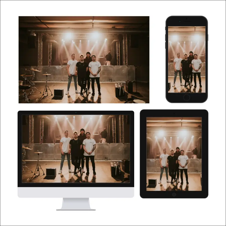
Visual Guide to Choosing Images
The below examples show how parts of an image will be trimmed off when automatic scalling occurs for smaller screens (responsive design)
Vertical Images don't work on Desktop
This example shows what happens when a portrait (vertical) image is used.
It may look ok on Tablet / Phone - elements are cut-off on Desktop screens
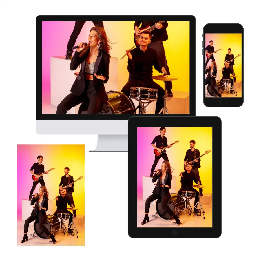
When the subject matter fills the image frame...
This example shows what happens when the subject takes up too much of the image - important parts are lost when it scales to mobile screens (I imagine this would make for some unhappy band members)
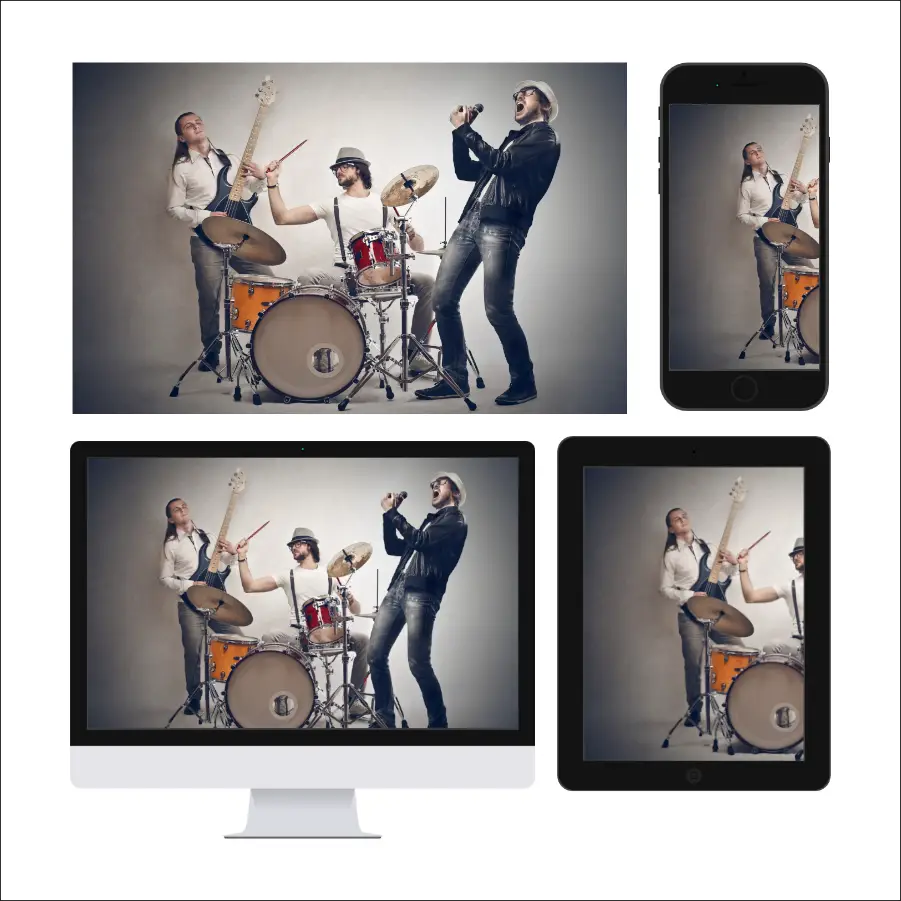
✅ This is perfect ✅
In the example below, the band members are placed in the middle-distance. This means when it scales down - it can always see all parts of the the band and the image looks great on all screen sizes